Ionic - Using Chart.js
import { Chart } from 'chart.js';In the world of data, visualization plays the important role. It helps the business to identify the various patterns. More and more of data visualization and data scientist professional are being required. With great demand in visualization, great tools and technologies are emerging too.
In this post we are will be looking upon Chart.js with Ionic. It's an open source javascript library, which provides some predefined charts. Developers can easily integrate these charts into their web application. Syntax and integration of Chart.js is also very simple.
We assume that you have already installed ionic on your system, if not please follow the steps given on ionic documentation. Let's first create an ionic application
ionic start ChartJsDemo blankNow our application is created, let's install Chart.js into our application
npm install chart.js --saveNow we are ready to incorporate Chart.js into our application. To import Chart.js into our application, all we need to do is import it as other npm modules.
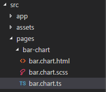
import { Chart } from 'chart.js';Now let's create a page, which will show an example of using bar chart. Let's create a page structure as shown in below image

Let's see the code for each file
bar.chart.html
<ion-header>
  <ion-navbar>
      <button ion-button icon-only menutoggle>
            <ion-icon name="menu"></ion-icon>
      </button>
      <ion-title>
            Bar Chart in Chart.js
      </ion-title>
  </ion-navbar>
</ion-header>
<ion-content padding>
  <canvas #barchart></canvas>
</ion-content>
Since Chart.js is dependent on canvas technologies, which we will be using within our typescript file to render the bar chart.
bar.chart.ts
import { Component, ViewChild, OnInit } from '@angular/core';
import { Chart } from 'chart.js';
@Component({
    selector: 'bar-chart',
    templateUrl: 'bar.chart.html'
})
export class BarChartPage implements OnInit {
    @ViewChild('barchart') barchart: any;

    ngOnInit(): void {
        console.log(this.barchart.nativeElement);
        let ctx = this.barchart.nativeElement.getContext('2d');
        let barChart = new Chart(ctx, {
            type: 'bar',
            data: {
                labels: ["2000", "2005", "2010", "2015", "2016", "2017"],
                datasets: [{
                    label: 'Yearly % Change in India\'s Population',
                    data: [1.20, 1.20, 1.27, 1.47, 1.67, 1.86],
                    backgroundColor: [
                        'rgba(255, 99, 132, 0.2)',
                        'rgba(54, 162, 235, 0.2)',
                        'rgba(255, 206, 86, 0.2)',
                        'rgba(75, 192, 192, 0.2)',
                        'rgba(153, 102, 255, 0.2)',
                        'rgba(255, 159, 64, 0.2)'
                    ],
                    borderColor: [
                        'rgba(255,99,132,1)',
                        'rgba(54, 162, 235, 1)',
                        'rgba(255, 206, 86, 1)',
                        'rgba(75, 192, 192, 1)',
                        'rgba(153, 102, 255, 1)',
                        'rgba(255, 159, 64, 1)'
                    ],
                    borderWidth: 1
                }]
            },
            options: {
                scales: {
                    yAxes: [{
                        ticks: {
                            beginAtZero: true
                        }
                    }]
                }
            }
        });
    }
}
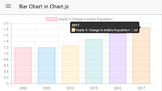
The result of the above code will look like as shown below.

The full example source for the demo can be found on github. In the github source code we, have also included an example of pie-chart too for reference purpose.